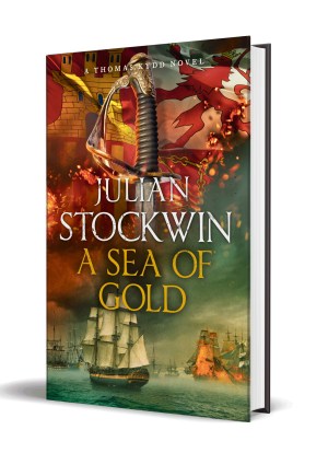
Cover Story: A Sea of Gold
A book’s cover is basically the face of the work, reflecting its genre and what a reader might likely expect inside. These days it’s also important for a cover to look good as a thumbnail so that ebook browsers can readily spot what they’re interested in. I’ve been very fortunate in the covers of the Kydd Series – initially painted by the renowned marine artist Geoff Hunt, and now created by the very talented digital artist Larry Rostant, who’s been behind the book jackets of Clive Cussler, Simon Scarrow, Con Iggulden and many other famous authors.
So just how was the stunning ‘face’ of A Sea of Gold created? A big thank-you to Assistant Editor Thorne Ryan for taking us behind the scenes of my latest Kydd tale.
Over to Thorne. . .
‘Julian is a wonderful author to work with in all regards, but especially concerning cover briefs. He always sends over clear instructions for what he wants on the cover of his books, from the positioning of the ships to the flags that should be used at the top. I put these instructions into a briefing form and email it to the art department. It then goes into the monthly briefing meeting that is attended by various people including our MD, Sales Director, Head of Sales and Art Director. They discuss the brief and, if approved, the cover is signed off.
Sarah Christie, the designer who always handles Julian’s titles, works with Larry Rostant to put the cover together, and then sends it over to Julian’s editor, Oliver Johnson, for approval. He passes this on to Julian for his comments. Once everyone has approved, the full cover layout is circulated three times, at which point any corrections to blurb, author biography etc. are made. When the cover has been signed off as final, a ‘wet proof’ (a mock-up of the final cover, including final finishes such as foil, embossing, spot UV etc.) is produced to make absolutely sure the cover looks as wonderful as it should – and it always does! Finally, the cover goes to press.’
Larry Rostant elaborates on his role. . .
 ‘My work is created from photographic images that are combined and manipulated to create the final image.
The process starts with a very precise brief from Hodder’s design manager, and a lot of technical input from the author, then it’s a question of finding imagery that works, either from my own library or from online photo libraries. Searching – or indeed shooting – the source images takes as long as combining them, especially as there are limited images available of appropriate ships; I often have to combine several ships to create the final one in order to get round this. Once I have all the images that I need, I can begin the process. This can take a day or two but when I finally have all of the elements roughly in place, I can send the image over to the publisher and the author for approval. As the image and reference are so well briefed, there are often very few alterations needed . . . happily! I then make any changes required and finesse the art for the final cover.
The series changes gradually as we continue in order to keep it looking fresh. Note that we no longer use two weapons crossed over the flag and I’ve started adding sparks and smoke to give more of a sense of atmosphere.’
Avril McCready, who deals with the production side of the Kydd books, explains this process. . .
‘Our cases (hardback covers), covers (paperback covers) and jackets are printed at the same supplier as the interiors. In some cases, and depending on the complexities in the finishes, some of the finishes may have to go out to another specialised supplier.
The printer works from files which are digitally produced to suit the presses that we will be using and the materials that we will be printing on. The covers or jackets are mainly printed in four colours: Cyan, Magenta, Yellow and Black – or CMYK. So, every colourful image is broken down into four different combinations of dots or pixels to create a printed reproduction of the original. For some of the covers, we may print with an additional fifth colour if we cannot reproduce a colour using the CMYK colours. This colour is selected from the Pantone swatch catalogue. This is very rare, and we get a very good representation from printing in four colours due the advancement in inks, colour-matching profiles and printing technology these days.
When the covers or jackets are printed, they go through the press and all four inks hit the paper at once. The ink is dried instantly as the paper passes through the machine. The sheets are automatically collated and then rested to allow the paper to settle before they go the finishing stages. The finishing stages can consist of foil stamping, UV varnishing or embossing etc.
For the Kydd covers, we apply a foil to the dried printed sheet. The foil is a very thin layer of metallic pigment sheeting and very similar to the foil used in gilt edging. It is an expensive process and used only on a handful of our titles. The foil is heat-transferred by stamping the foil with a brass block which shows the text in reverse, so that the words appear on the cover in the right reading order. This is then allowed to cool before a clear film lamination is added. The lamination is either matt or gloss, and is applied over the foil to protect it from damage or scuffing. If we add a spot-gloss varnish, the cover or jacket is put through the press again to have this added, so we have to re-register the position of fine or small type on a laminated sheet post-printing and post-lamination, which can be very challenging.
For the hardback edition, we select an imitation cloth and a foil for stamping from an approved range to create our cases. These are made to our specification for each title. While we’re doing this, the interiors are printed, folded, sewn and then trimmed for the hardback or left untrimmed for the paperback. The hardback case is then added to the case board on the binding line and then moved onto another machine to have the jacket applied. For the paperback edition, the interior sheets and printed, laminated covers are put on the binding line together and then the pages are trimmed flush in one hit.’
And, fittingly, my editor Oliver Johnson has the last word. . .
‘Accuracy is a key factor in briefing Julian’s jackets — historical fiction devotees, and particularly fans of novels set in the Age of Fighting Sail, are sticklers for detail and any error will be swiftly pointed out. When I took over Julian’s books I was excited to learn that Larry Rostant was the cover artist as he was someone whose work I knew well and admired tremendously. We deliberately established the briefing process set out above. I cannot think of any other author where the detail is so fine and the process so streamlined. And, of course, where the end result (Larry’s work) is so widely admired!’
Do you have a favourite Kydd cover? I’d love to hear your thoughts.
A Sea of Gold is published in the UK on November 1 in hardback, ebook and audiobook (read by the inimitable Christian Rodska). It will be simultaneously available in ebook and audio-download in Australia, Canada, the States – and elsewhere around with world – with the hardback available in those countries a month or two later.
Readers outside the UK might like to know that the title can be pre-ordered at the Book Depository https://www.bookdepository.com/Sea-Gold-Julian-Stockwin/9781473641075 and will be shipped out on the UK publication date, with free postage worldwide!

I am a dunderhead when it comes to financial things. I didn’t fully understand the scheme that Renzi was tasked with. Could anyone explain it me in modern terms? Was he using money from someone else to pump into the British war effort and domestically?
I remember an artist who was excellent doing the covers of the ” Douglas Reeman ” series of books.They do enhance the whole picture.I wish Icould remember his name.Michael Parks
Geoffrey Huband.
I never knew such effort went into the cover production! Very interesting, and I have no favourite cover as they all represent to me the excellent content within.
Thanks for the feedback, Deni!
The covers of your books are just so beautiful and in a style all by themselves. I enjoy watching them if only for the pleasure I derive from doing it.
The use of a flag and a sword is terrific and I have to disagree with the idea of having the figure of Kydd himself on the covers, I am afraid it would spoil the artistic impression. They are perfect just as they are.
My favourite Kydd cover is “Inferno” if only for the Dannebrog (the Danish flag) on it, but then I am from Copenhagen 🙂
Thanks for your vote, Susanne! Copenhagen is one of our favourite cities, by the way.
I am currently reading through this fantastic series, now enjoying “Caribbee”. I am a digital reader, buy the books on Amazon’s Kindle store, and read them on my iPad. It would be great if we could somehow be able to significantly expand your covers to see the details.
Not sure whether this can be done, Chip, but will look into it
Pingback: Cover Story: A Sea of Gold | Nighthawk News
Thank you for the extra efforts taken in the production of these covers. For me, they help set the mental stage from which to launch my imagination each time I pick up one of his books.
Regarding covers of your excellent books. The present covers are very good indeed. However I miss seeing the figure of Kydd himself on the cover and perhaps Renzi and others.
Can you commission an artist to create a series of drawings etc of the main characters and then sell them to fans like myself
An interesting idea, Ian!